
Instagram Saves, worth coming back to.

The more you save, the less you can find.

An interactive prototype. In its flows, finding a half-remembered post takes about 10 seconds instead of 90, and saving into a new collection takes 1 tap instead of 2 and a name.

Research, UX/UI, and prototyping
Self-initiated redesign concept, 2026
Based on 9 user interviews, with an interactive mobile prototype as the output.

The short version

Situation. Saving on Instagram takes one tap. Finding that save again means scrolling through all of them.

Task. Make saves easy to find again, without asking people to organise more.

Action. I ran 9 user interviews and turned them into a customer journey map. 6 of 9 named the same problem, so search came first, then lighter filing, notes, and pins.

Result. An interactive prototype. In its flows, finding a half-remembered post takes about 10 seconds instead of 90, and saving into a new collection takes 1 tap instead of 2 and a name.

The prototype hasn’t been tested at scale yet, so both numbers come from walking through the flows.

Problem

You saved it for later, and later is here. You remember the reel, more or less. You open Saved and start scrolling. Still scrolling. I kept losing references I’d saved on purpose: saving worked, getting back to them didn’t.

My hypothesis is that Instagram should care too. A save is a strong signal of intent: someone wanted to see this again. If Saved works, people get one more reason to come back to the app. If it doesn’t, those signals just go to waste.

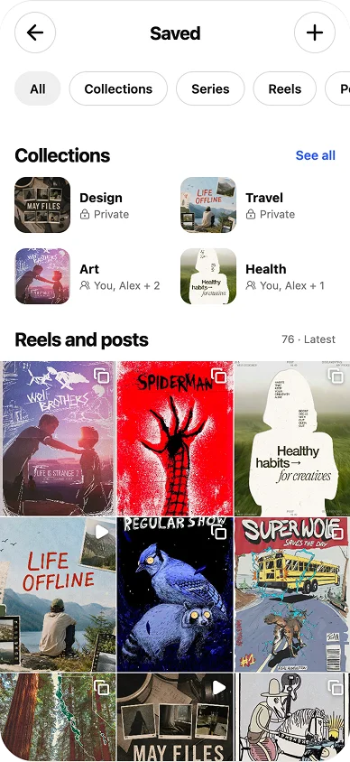
Current Saved screen with collections and a grid of 76 saved posts, without search.
Saved today: collections, then one long grid. No search.

Goal

So the goal wasn’t another way to save. It was a way back.

That means getting people back to a specific save quickly. At Instagram’s scale, I’d know it works by the share of Saved visits that end with a post opened, searches that end in an open and how long they take, and the share of saves filed into a collection and how often suggestions are accepted. The guardrail metric: saving has to stay one tap, and total saves shouldn’t drop.

Research

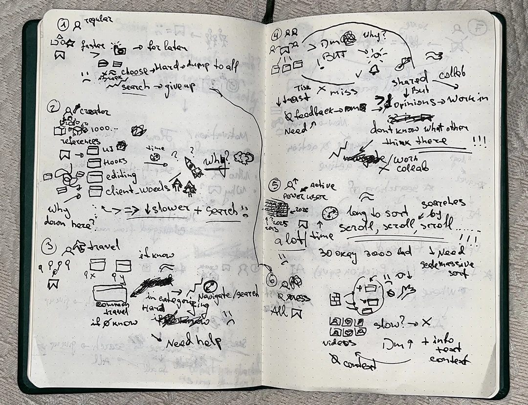
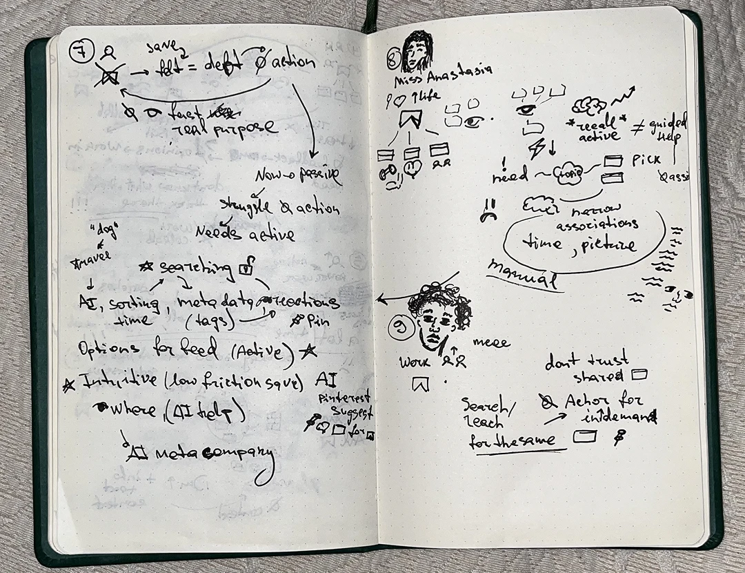
I ran nine user interviews and asked everyone the same questions: why they started saving, how they save and find things now, what they’ve tried before, and what they use instead.

First notebook spread of Igor's interview doodles and handwritten observations about saving and finding posts.
Second notebook spread with sketched people and notes about revisiting, organizing, and remembering saves.

My interview notes, drawn as well as written.

6 of 9 named finding a specific save as their main problem.

Main problem: finding a save

  • Casual recipe saverSave without thinking, find by meaning later.
  • Creator with a reference libraryKeep the reason, not only the post.
  • Saving for yearsStay usable with thousands of saves.
  • Heavy Reels viewer who never filesFind from a vague memory, without filing.
  • Overwhelmed by manual searchAnchors to search by: when it was saved and what the picture shows.
  • Returns to the same referencesKeep repeat references close, and a shared folder worth trusting.

Main problem: something else

  • Travel plannerGet the place out of the video.
  • Shares a collection with a partnerGo from collecting to deciding together.
  • Mostly stopped using SavedHelp letting go, not only keeping.

Each need is my synthesis of that interview, not a quote. Nine people set the direction, but they don’t speak for every Instagram user.

Other findings

Customer journey map

To see where each of these breaks the experience, I put all nine interviews on one customer journey map.

StageWhat people doWhat breaksWhat fixes it
1. SaveTap Save and keep scrolling.Picking a collection interrupts the scroll, so a lot of saves never get filed.Decision 3: suggested collection
2. OrganiseMake more collections, or plan a weekly clean-up.Too many collections, no clear place for a post. One weekly review lasted two weeks.Decision 3: fewer choices to make
3. RememberRecall what the post showed and roughly when.Memory works by subject and time. Saved works by folder.Decisions 1 and 2: search and a date range
4. FindScroll the grid, open a post, go back.Posts look alike and you lose your place. After a minute or two, people give up and look for something new.Decision 1: search inside Saved
5. UseCopy it to Notes, Notion, Maps, or a chat to act on it.The reason and the next step live outside Instagram.Decisions 4 and 5: notes, pins, reactions, a collection feed

Priorities

The map made the order clear. Search went first, because it served six people.

  1. Search and a date filter.
  2. Collection suggestions.
  3. Notes and pins.
  4. Then, to test: shared reactions and a collection feed.

Left for later, since each came from one person: places from travel videos, planning together as a couple, bulk tools and export, and help letting go of saves.

Wireframes

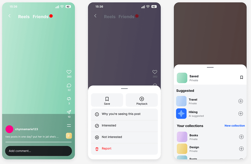
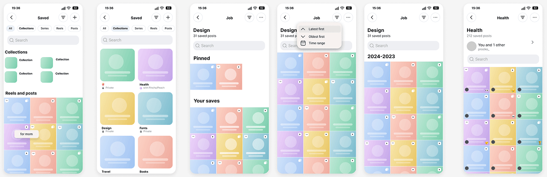
I wireframed the two main flows, saving and finding, before designing the screens.

Early three-screen wireframe flow from watching a reel to a save prompt and suggested collections.
Saving: from a reel to a suggested collection.
Wireframe sequence exploring saved-content management, collections, and search states.
Finding: collections, search, and result states.

Decisions

1. Search inside Saved

People remember what a post showed, not who posted it or where they filed it. “There’s no way to search for ‘pasta with lemon’ inside my saves.”
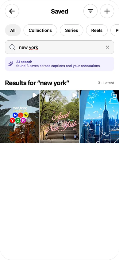
Prototype search for new york returning three saved posts.

A place you remember.

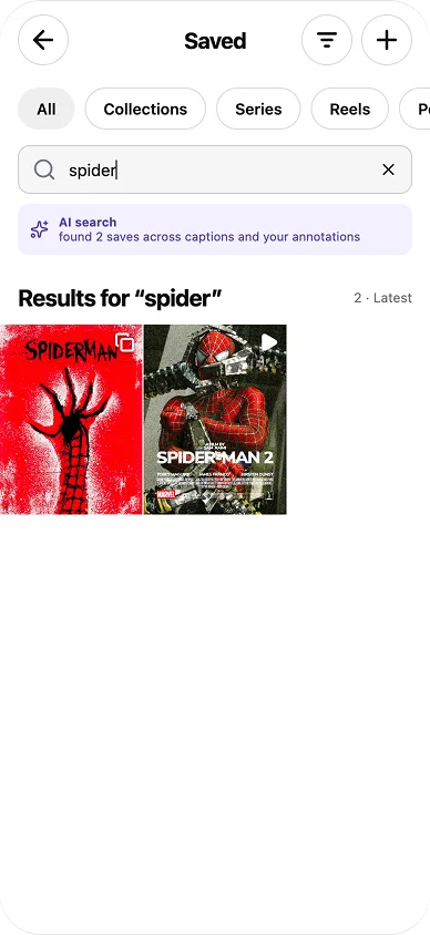
Prototype search for spider returning two saved posts.
  1. Search, right inside Saved
  2. Across titles, your notes, and AI descriptions

A subject you remember.

These are designed result states. Whether AI search reliably finds the right save still needs testing on real libraries.

So I added search across titles, your notes, and AI descriptions of each post, right inside Saved.

It works on saves people already have. One person said they’d skip a redesign that made them organise by hand, and another wanted to search by what the picture shows.

I could have nudged people to organise better, but that’s work up front, and it’s exactly the work people skip.

Finding a half-remembered post takes about 10 seconds instead of 90 of scrolling.

estimate for 76 saves
2. Sort and filter by save date

A long-time saver knew roughly when they’d saved a post but couldn’t jump to a month or year. Another person wanted time as an anchor for searching.

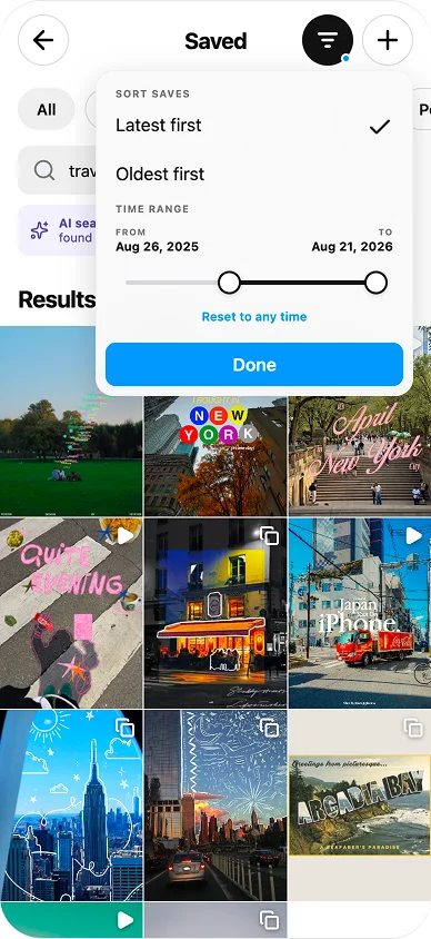
Saved search filter with latest-first and oldest-first sorting and a saved-date range from August 28, 2025 to August 27, 2026.
  1. Oldest-first sorting
  2. A saved-date range

Narrow the time window.

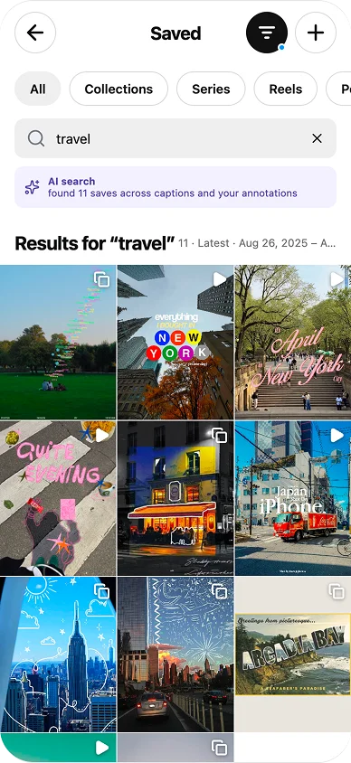
Travel search results with the selected date range and latest-first sort shown above the grid.

The range stays in view.

I added oldest-first sorting and a saved-date range next to search. The active range stays visible above the results.

With years of saves, even a rough time window cuts the pile down a lot.

3. Suggested collections when saving

Filing means finding a collection or naming a new one, mid-scroll. “I don’t want to interrupt what I’m doing.”

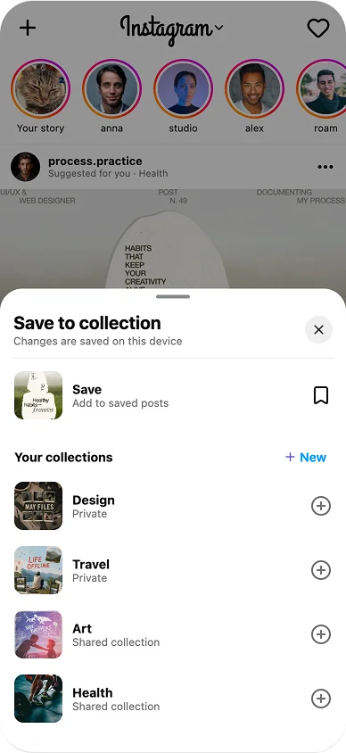
Original save sheet showing the collection list.

Before: find or name it yourself.

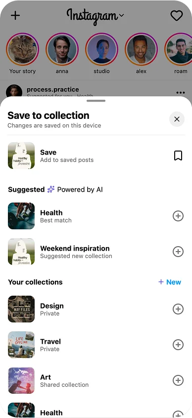
Redesigned save sheet suggesting an existing collection and a possible new collection.
  1. The best-matching collection
  2. A new one, its name filled in

After: two suggestions on top.

The save sheet now shows two suggestions above the full list: the best-matching collection, and a new one with a name already filled in.

This makes the choice easier without taking it away. The full list stays for when a suggestion is wrong.

Saving into a new collection takes 1 tap instead of 2 and a name.

counted from the designs

4. Notes, pins, and reactions

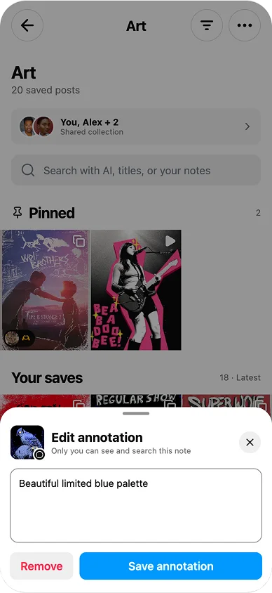
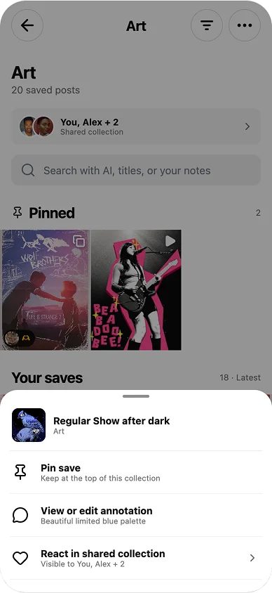
A collection keeps the post, not the reason: one creator kept Notion just to write reasons down. Another kept going back to the same references, and shared collections gave no feedback.

Annotation editor with a note about a limited blue palette.

A note in your own words.

Saved-post actions for pinning, annotations, and shared reactions.
  1. Pin
  2. Note
  3. React

Pin, note, or react.

I added short notes on a save that you can search later, pins for references you go back to often, and reactions for shared collections.

A note becomes one more way back, in your own words.

Shared notes still need a clear “who can see this” state before testing.

still open

5. Collections in the feed selector

One person stopped using Saved: it had turned into a backlog of things never read, made, or bought. Saving had replaced doing.

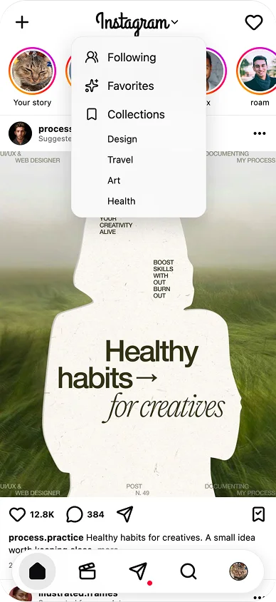
Instagram feed menu expanded to show Following, Favorites, and Collections with Design, Travel, Art, and Health choices.
  1. Collections, next to Following and Favorites
A collection in the main feed selector.

I put collections in the feed selector next to Following and Favorites, so a Design collection can become a daily feed.

That way saves get a place in everyday browsing, instead of a folder nobody opens.

It might just become more scrolling, and it doesn’t help people let go of saves, so it needs testing.

open question

Results

When I showed the prototype, people reacted warmly: “this is a massive improvement”, “really convenient”.

That’s nice to hear, but it’s an early reaction, not evidence. So these numbers are estimates from the flows:

Time to find a half-remembered post
Today: scroll the grid
≈90 s
Prototype: search
≈10 s

One mark is 10 seconds. Estimate for a library of 76 saves, like the one in the prototype. Bigger libraries make the gap wider.

Saving into a new collection

Today, 4 steps

  1. Save
  2. New collection
  3. Type a name
  4. Done

Prototype, 2 steps

  1. Save
  2. Suggested collection

Counted from the designs.

Start with what you remember, then narrow it down.
The same tap, plus a helpful collection suggestion.
Add a note, leave a reaction, keep a reference close.

Next steps

I’d test it on real, messy libraries. The search results in the prototype are designed states. Next, I’d run a task-based usability test with 5 people on their own saves, timing how long it takes to find a post they remember in today’s Instagram and in the prototype. At scale, the success metrics above would tell if it works.