
SuperGood

Homemade food, without making the order feel like a gamble.

Repeating a usual order went from about 60 seconds to about 5. After the release, the store rating went from 3.1 to 3.7, and one codebase replaced two.

Product designer and the only mobile engineer at PizzaSushiWok, a small company
11 months, 2024
Shipped on iOS and Android, and later closed for financial reasons.

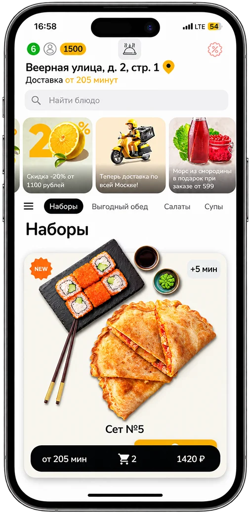
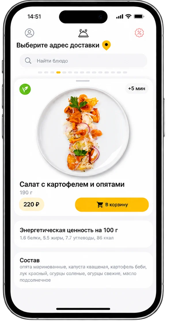
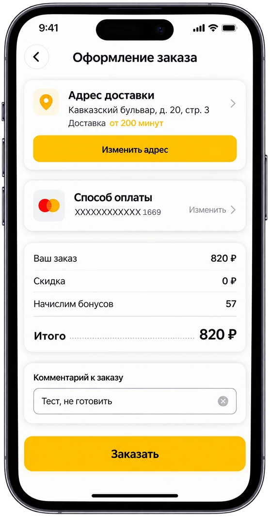
SuperGood menu with a pinned bar showing delivery time, item count, and total.Dish card with weight, price, nutrition, ingredients, and an add-to-basket button.Checkout with address, delivery time, payment, bonuses, and total on one screen.

The short version

Situation. SuperGood delivered homemade food through two separate apps, one for iOS and one for Android. In reviews, people weren’t sure the food was worth the price, and the app made ordering harder than it needed to be.

Task. Make the everyday order quick and clear, especially the usual weekday lunch, and turn two apps into one. I was the only person working on it.

Action. I read about 150 store reviews, ran a contextual inquiry with 10 people ordering at work, and checked my changes in a comparative usability test with 10 colleagues. Then I redesigned the menu, the dish card, and reordering, and built it all in Flutter.

Result. Repeating a usual order went from about 60 seconds to about 5. After the release, the store rating went from 3.1 to 3.7, and one codebase replaced two.

The usability test was small and internal, so its numbers show direction rather than proof. The store rating is public.

Problem

People weren’t sure the food was worth it, and the app didn’t help. SuperGood competed with Кухня на районе for everyday meals: lunch at work, or dinner when you don’t feel like cooking. To see why people hesitated, I started with the public reviews.

What public reviews complained about
≈30%
The app. This part was mine.
≈70%
The food for its price. Kitchens and prices weren’t part of my role.

A rough split from about 150 App Store and Google Play reviews.

Most complaints were about the food for its price, which wasn’t mine to change. The ones about the app came down to three things.

  1. You couldn’t see the delivery time or the total while choosing dishes.Answered by decision 2. A pinned bar with time and total
  2. Categories moved as you scrolled, so it was easy to lose your place.Answered by decision 2. A pinned bar with time and total
  3. Every weekday lunch meant finding the same dishes again.Answered by decision 1. Reorder from order history

Goal

I joined as a mobile engineer. Kitchens and prices weren’t mine to change, so I took the part that was: the whole ordering experience, from research to the Flutter rebuild.

The goal was to remove the reasons to hesitate before paying, and to make the usual order take seconds. To know if it worked, I’d look at the time, success rate, and ease (SEQ) of repeating an order, at app complaints in reviews, and at the store rating. The limits were clear from the start: no say over the food or prices, and one engineer for two platforms.

Research

Four kinds of research shaped the redesign:

Watching people order made one thing clear: weekday orders repeat. People already knew what they wanted, but the app made them look for it again every time.

I wrote what I heard as three job stories (Jobs to be Done). Each one led to one of the first three decisions:

  • When it’s lunchtime at work, I want my usual meal again with no effort, so ordering takes seconds.
  • When I’m deciding whether to order, I want to know when the food arrives and what it costs, so nothing surprises me after I pay.
  • When I pick a dish, I want to be sure it’s worth the price, so I don’t feel I overpaid.

Decisions

  1. 1. Reorder from order historyReordering went from 8 steps to 3, and from about 60 seconds to about 5.
  2. 2. A pinned bar with time and totalTime and total went from two taps away to always visible.
  3. 3. Weight, nutrition, and ingredients on the dish cardThe new dish card did better than the old one.
  4. 4. Keep the patterns people knowLater reviews called it a fresher look with nothing new to learn.
  5. 5. One Flutter app for iOS and AndroidTwo codebases became one, built alone in 11 months.

1. Reorder from order history

Rebuilding a usual lunch meant finding each dish again in a menu that kept moving.
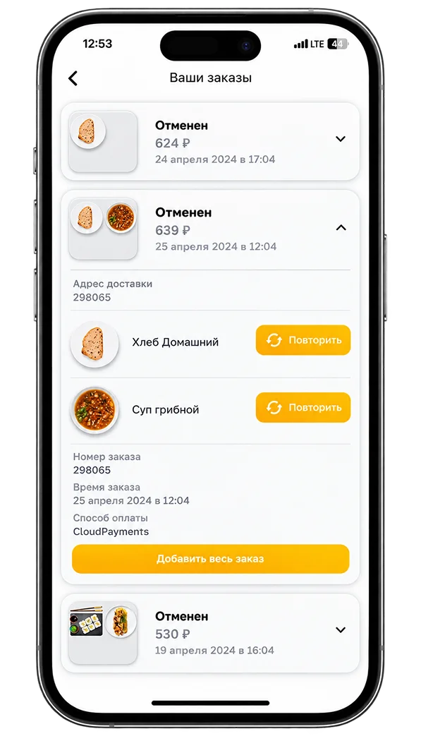
Order history with an expanded order, a repeat button for each dish, and an add-whole-order button.
  1. Repeat one dish
  2. Or bring back the whole order

So I turned order history into a way to order. You open a past order and repeat one dish or the whole thing. History is searchable, changed prices are flagged, and sold-out dishes show up grayed out.

Most weekday orders were repeats, so a past order was already the shortest way to the next one.

I also thought about favourites, but they work for one dish, and a usual lunch is a few dishes together.

Reordering went from 8 steps to 3, and from about 60 seconds to about 5.

steps counted from the flow, time from the usability test

Steps to repeat a usual order
Before: find each dish again
8 steps
After: history, add whole order
3 steps

Counted from the flow.

2. A pinned bar with time and total

People kept leaving the menu or losing their place, because time and total were hidden and categories moved.

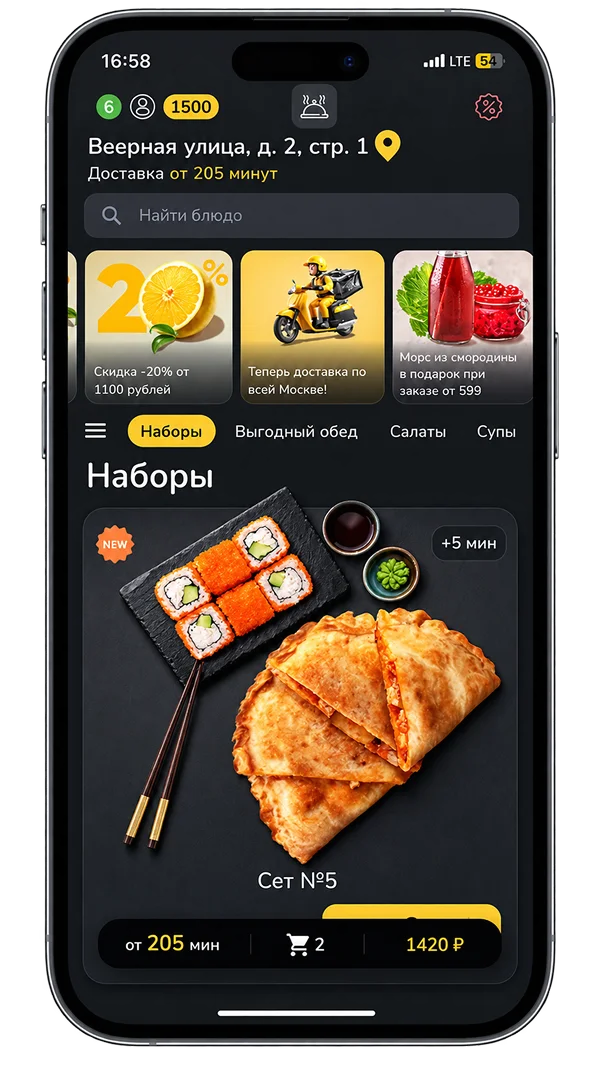
Dark menu with a fixed category bar and a pinned order bar showing time, items, and total.
  1. Categories stay in order
  2. Time, items, and total stay pinned

I added a pinned bar with the delivery time, item count, and total, put quantity controls right on the dish, and kept categories in a fixed order.

People checked time and cost before every order, and regulars shop from memory, so the screen had to stay still.

A basket badge with just a count would have been simpler, but people would still have to open the basket to see time and total.

Time and total went from two taps away to always visible.

counted from the flow

3. Weight, nutrition, and ingredients on the dish card

A photo didn’t tell people enough to judge whether a dish was worth its price.

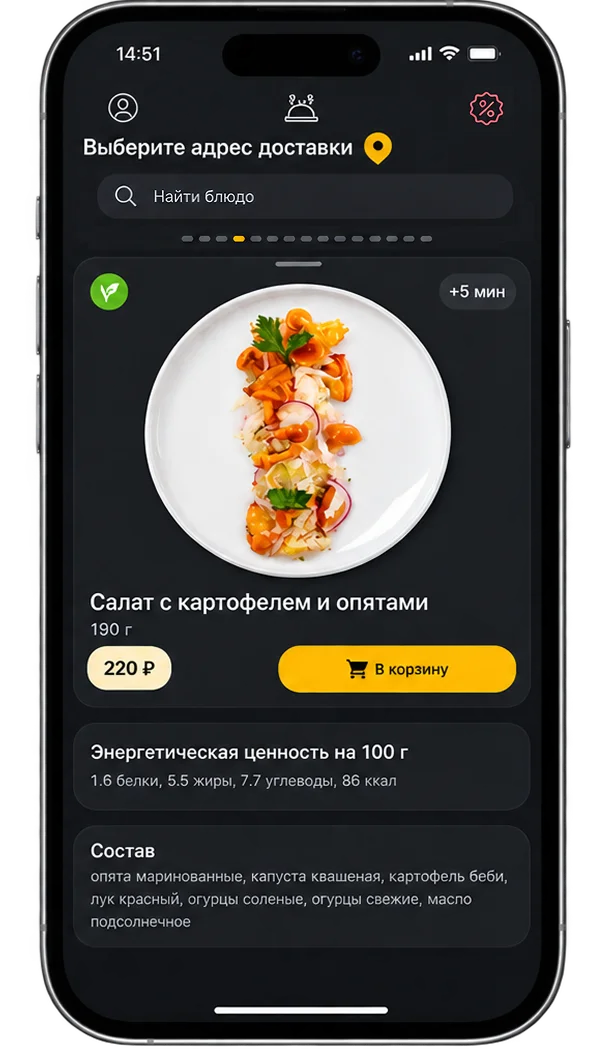
Dark dish card with extra cooking time, weight, the price next to Add, nutrition, and ingredients.
  1. Extra cooking time
  2. Weight, and the price right next to Add
  3. Nutrition and ingredients

The dish card now shows weight, ingredients, nutrition, and extra cooking time, with the price right next to Add.

I couldn’t change the price, but I could show what you get for it before you pay.

The new dish card did better than the old one.

same usability test

4. Keep the patterns people know

A redesign can make loyal customers relearn an app they use every week.

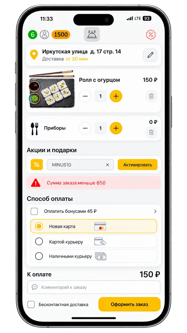
Basket with quantity controls, promo code, minimum order warning, payment methods, and total.
  1. Quantity controls
  2. Promo code and minimum order warning
  3. Payment methods
Basket patterns customers already knew from grocery apps.

I kept the structure people knew and borrowed patterns from Самокат and Яндекс Лавка, so the look changed but the habits didn’t.

Regulars order every week, and I wanted them to feel the improvement without relearning anything.

Later reviews called it a fresher look with nothing new to learn.

store reviews

5. One Flutter app for iOS and Android

With two separate apps, every change had to be built twice and could behave differently on each platform.

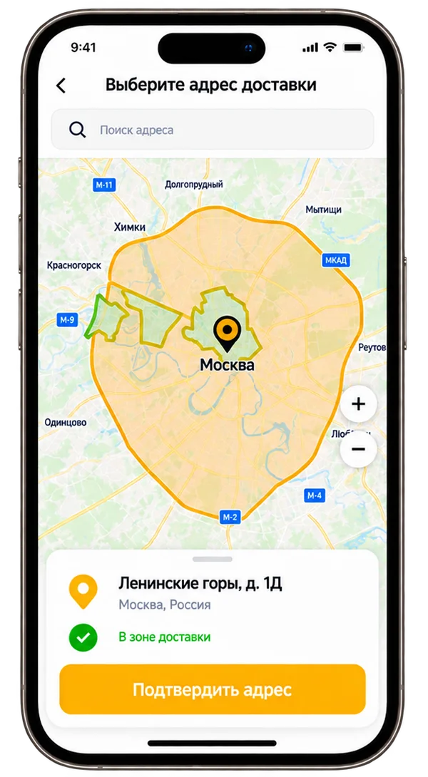
Address picker on a map with the delivery zone and a confirmation that the address is inside it.

Delivery zone check

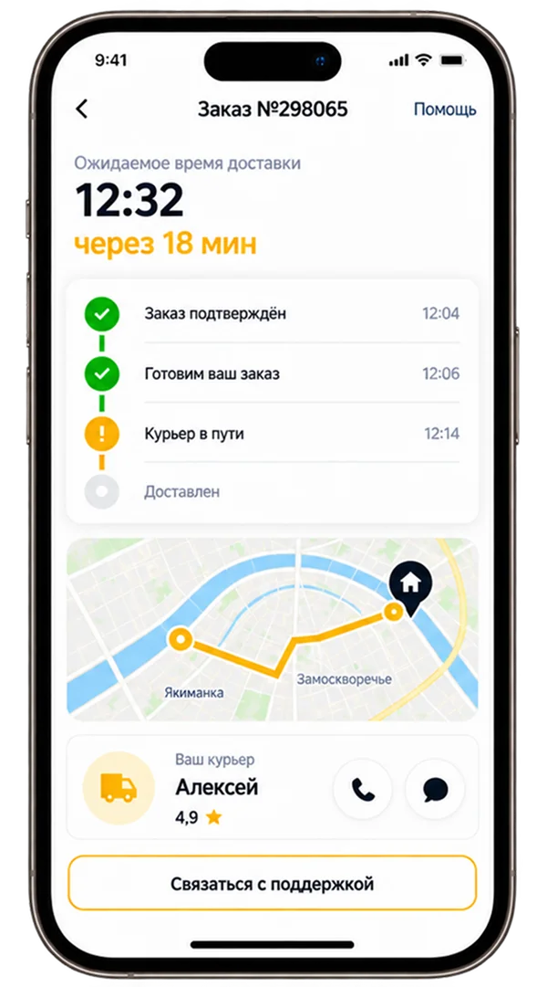
Order tracking with expected time, order stages, a route map, and courier contact.

Order tracking

I rebuilt both apps in Flutter from one codebase, from the menu and 3DS payment to tracking, loyalty, and light and dark themes on my own design system.

As the only engineer, one codebase meant every fix reached iOS and Android on the same day.

Keeping both native apps would have meant doing every change twice, by one person.

Two codebases became one, built alone in 11 months.

Results

I checked the redesign twice: in the usability test with colleagues, and in the stores after the release.

Time to repeat a usual order
Before: find each dish again
≈60 s
After: history, add whole order
≈5 s

One mark is 5 seconds. Usability test with 10 colleagues outside the app team.

In the same test, all 10 rebuilt their usual order correctly, up from 2 of 10 before. Ease went from 3 to 6 out of 7 on the Single Ease Question.

Store rating, out of 5
Before the redesign
3.1
After the release
3.7

Before and after the release, so the redesign isn’t the only possible cause.

In the new reviews, complaints about the food’s value stayed, but people praised the app: a fresher look, nothing new to learn, and an order history that actually helps.

SuperGood later closed because of the company’s financial situation.

Reflection

What I’d do differently isn’t on the screens. The business often pushed its own ideas first, and urgently, while fixes that mattered more to customers waited. I pushed back, but with opinions, not a process. Next time I’d: