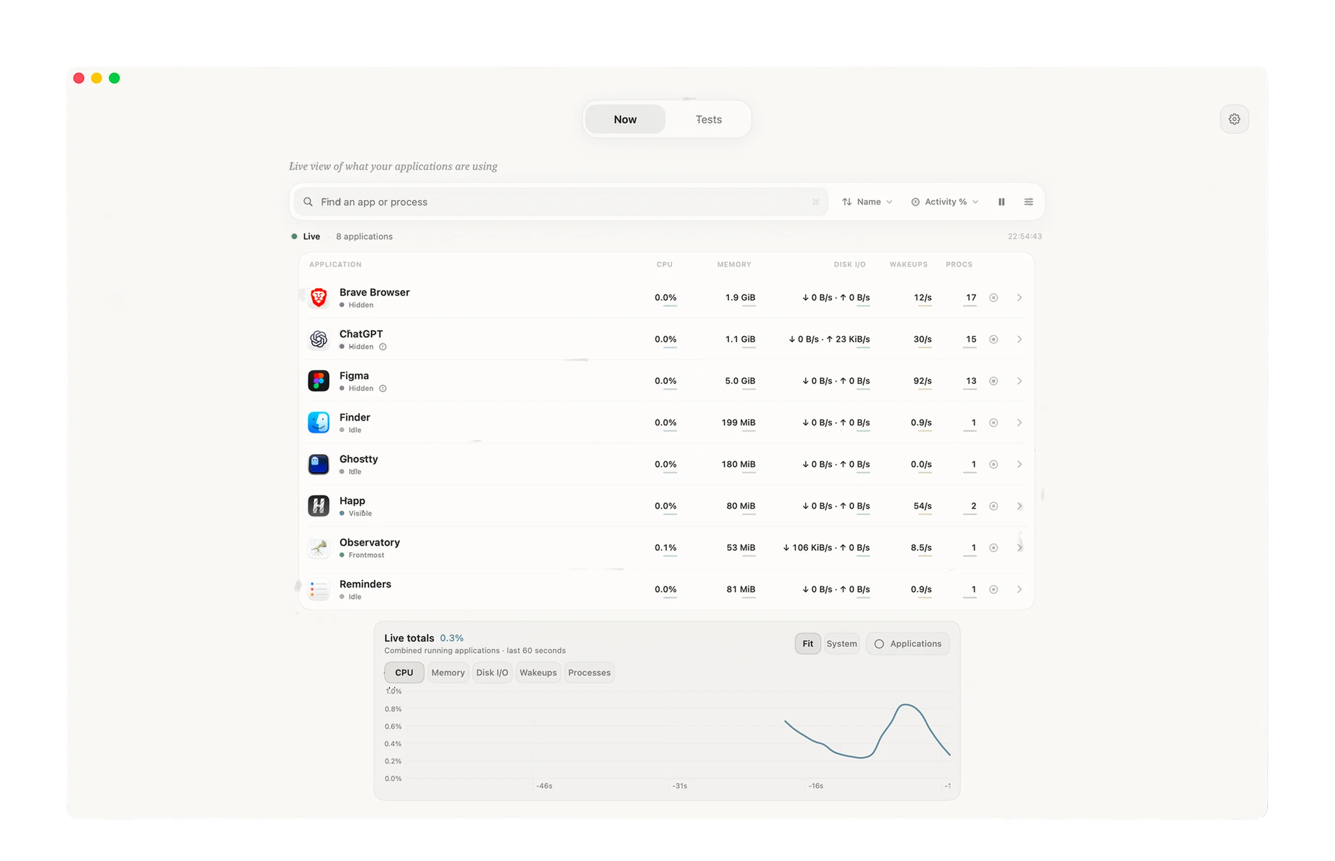
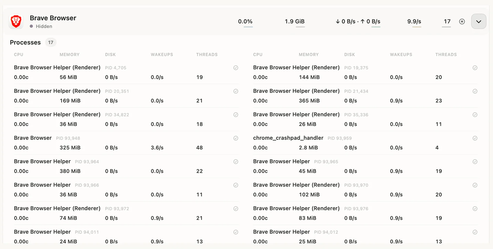
Reading one app’s total went from 17 rows to 1 (Brave Browser), which takes about 3 seconds instead of 60. All 3 colleagues who tried it still use it two months later.
Product design, research, identity, and the launch film. I wrote the specs and directed AI development 2026 Release 0.1.1 for macOS 14 and later, used by 3 colleagues for about two months.
The short version
Situation. Activity Monitor lists processes, not apps. One browser can take up 17 rows, and nothing is kept once the moment’s gone.
Task. Let people see an app as one thing, then record a run and compare it with the next one.
Action. I ran 5 customer development interviews framed around Jobs to be Done, to check it wasn’t just my problem. Then I sketched, made a rough prototype, and changed three things after walking through it.
Result. Reading one app’s total went from 17 rows to 1 (Brave Browser), which takes about 3 seconds instead of 60. All 3 colleagues who tried it still use it two months later.
The time estimate comes from walking through both apps, not from a formal study.
Problem
During heavy work I’d open Activity Monitor to find the app I was using. Its activity was split across lots of processes, so I had to find them, add them up in my head, and keep watching while they changed. Not exactly a calm way to check memory. And once the task ended, there was nothing to come back to.
The same app in both tools. Process names are as macOS lists them, and the total comes from Observatory’s live view.
So the job, written as a job story (Jobs to be Done):
When I’m doing heavy work, I want to see what an app is using and keep a record, so I can come back to it and compare.
Goal
It was a personal project, and I measured it against Activity Monitor, since that’s the tool people already open.
The goal was to answer “what is this app using?” at a glance, and to compare one run with another. To know if it worked, I’d look at how long it takes to read an app’s total, whether people can compare runs without screenshots, and whether anyone keeps using it.
Research
First, I checked it wasn’t just my problem. Before building anything, I ran customer development interviews framed around Jobs to be Done. Five people walked me through the last time they looked into performance: what they wanted to know, where they looked, and what they couldn’t find. Their answers showed it was worth building.
Independent troubleshooter
Checks their own Mac.
Job story. When I check what my Mac is doing, I want to see the whole app and catch a spike, so I don’t have to piece it together from a changing list.
Performance verifier
A developer comparing runs.
Job story. When I change my app, I want before and after recordings with enough context, so the comparison actually means something.
Both started from an app or a task, never from a process. So the interface, and my first sketches, start from the app.
From a loose field of processes to app groups.App totals first, process detail one level below.A shared recording window makes runs comparable.The first outline of a test and its result.
From the sketches I made a first prototype with three places to go: Now, Tests, and History.
Now: a quick look
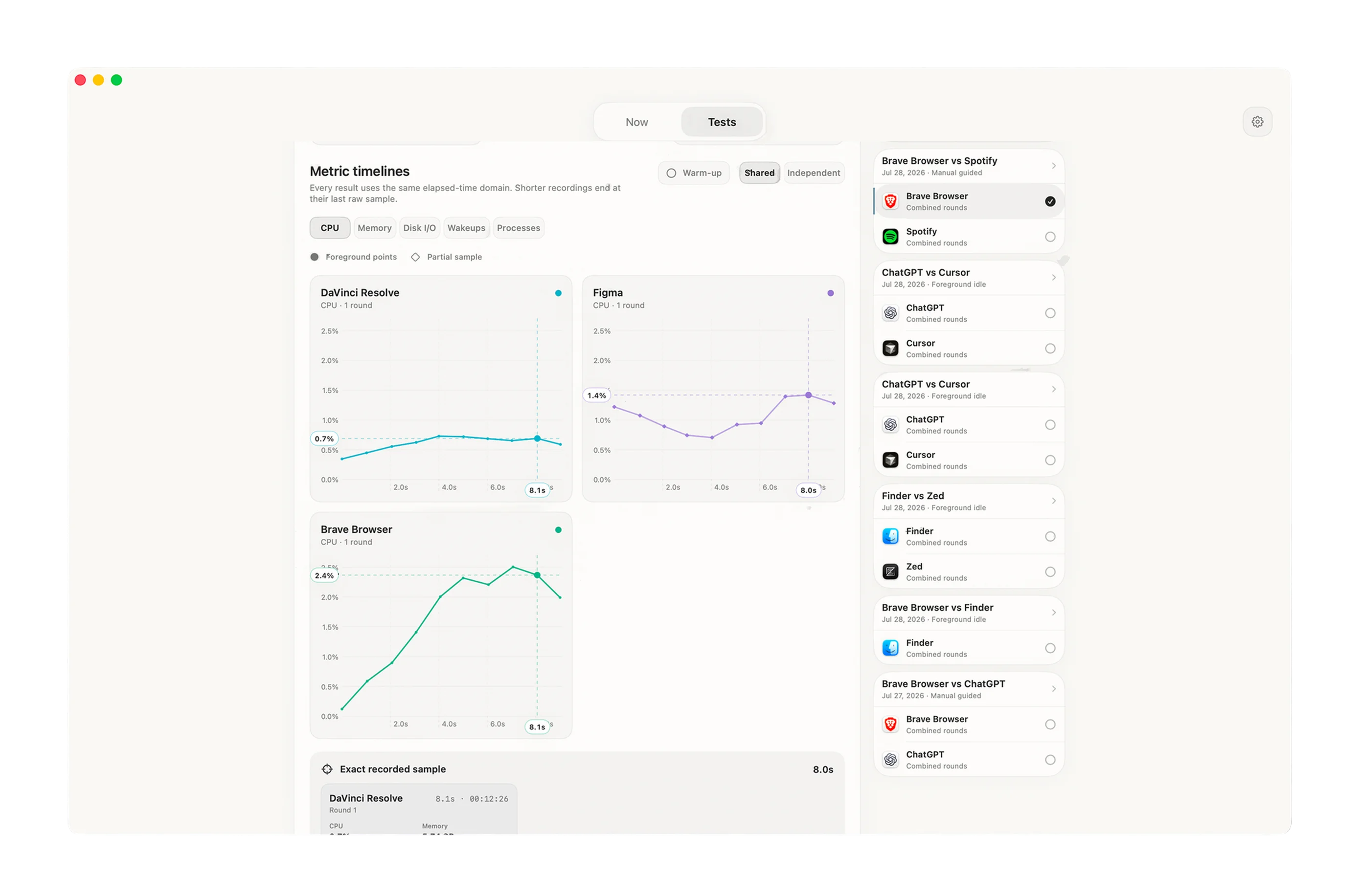
Tests: record a run
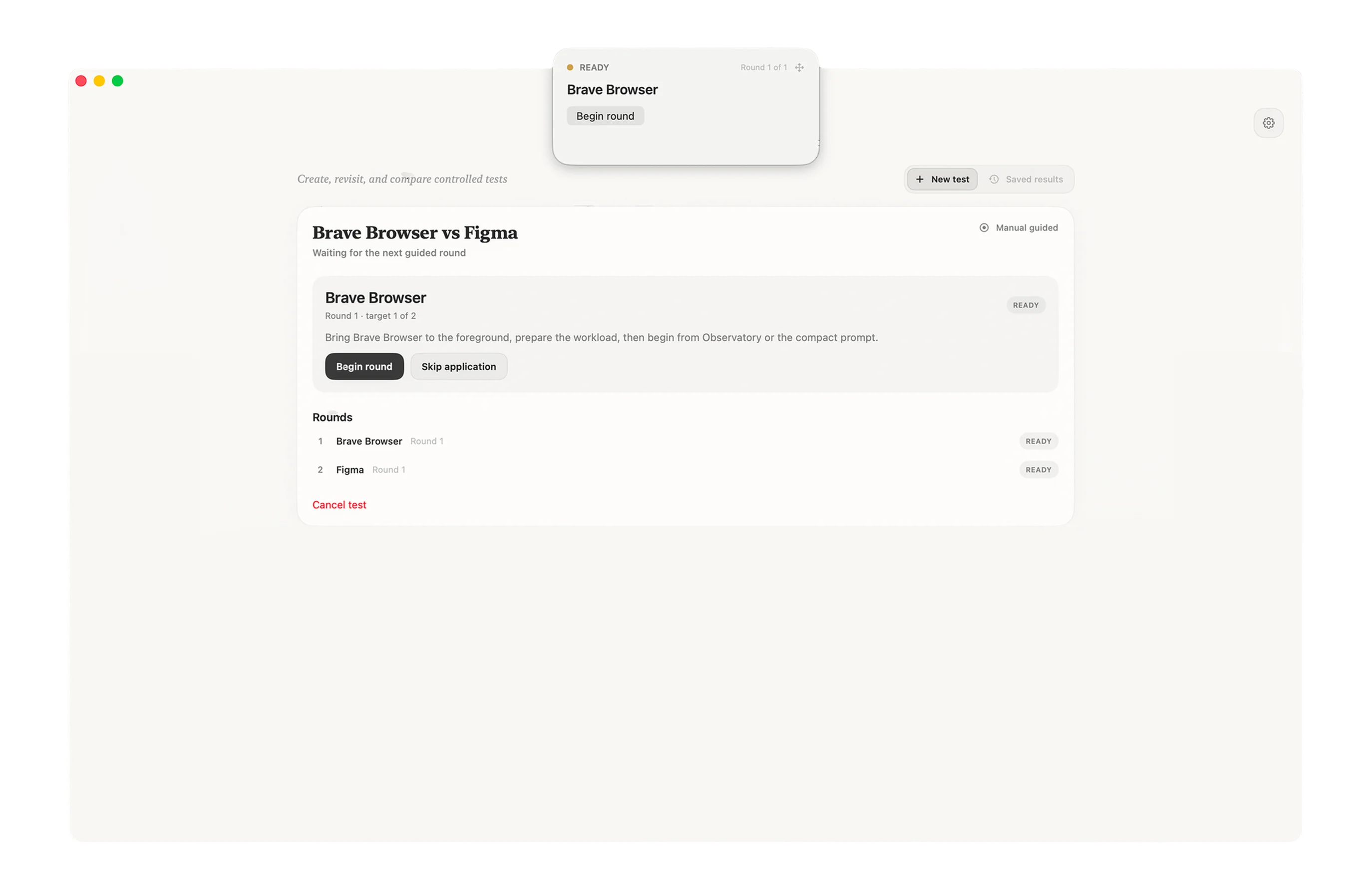
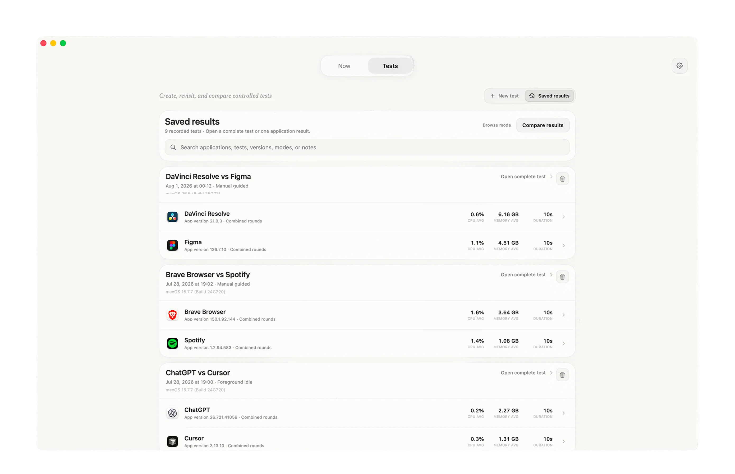
History: return to results
Decision 1 came straight from the interviews and sketches. Decisions 2 to 4 came from walking through this prototype, with task walkthroughs and design critique rather than a formal usability study.
Decisions
1. Group processes under their app
One app showed up as lots of rows, so its real cost was hidden.
One row, with the app’s totals
Its processes, one level below
Totals first. Processes when you need them.
So each app became one row with its totals. Its processes sit one level below and open only when you need them.
Both jobs started from an app. And things that belong together should look together, which is the Gestalt principle of common region.
A flat process list with search, like Activity Monitor, was the other option, but you’d still be adding up rows yourself.
Brave Browser went from 17 rows to 1.
measured in the live view
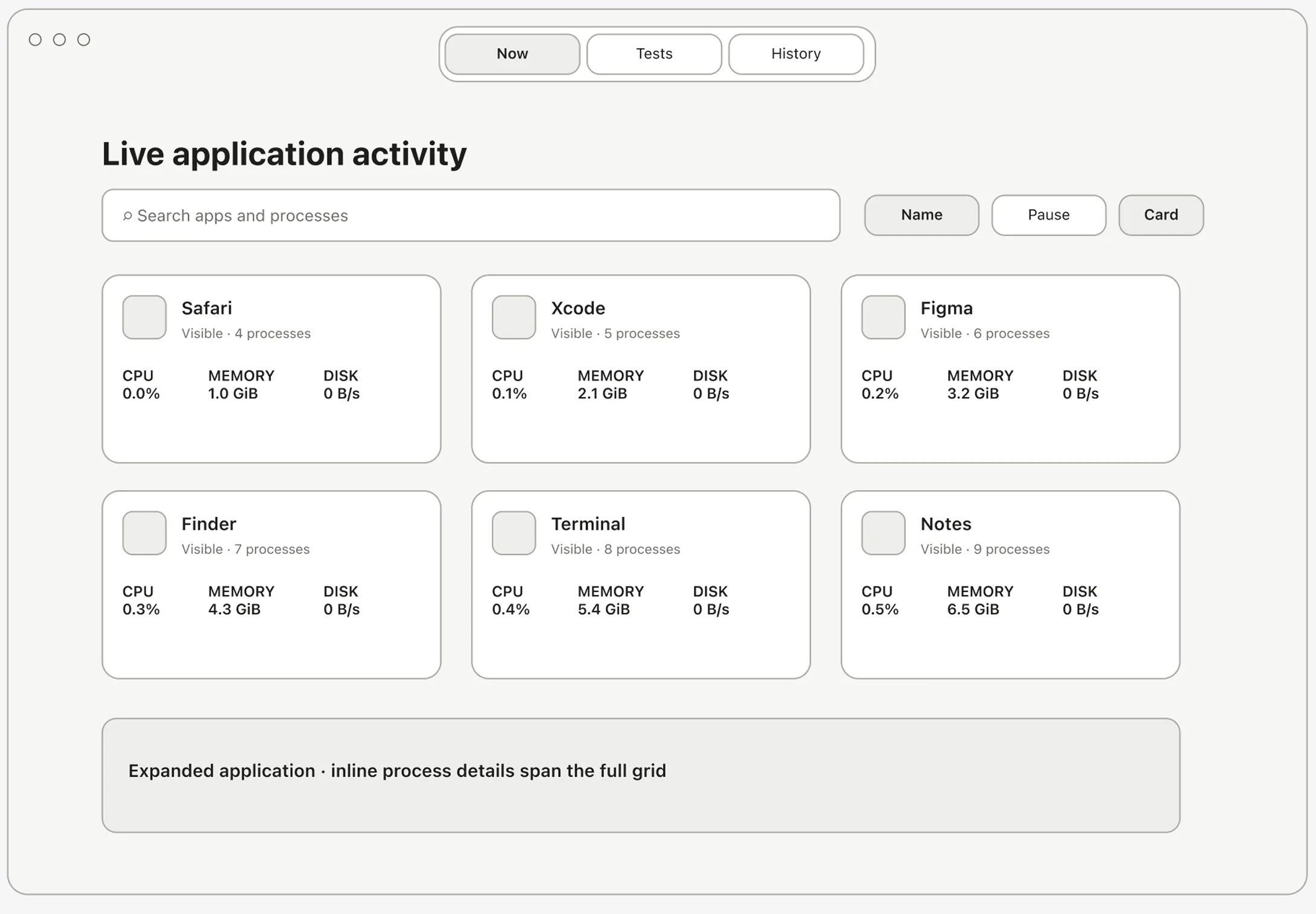
2. An aligned list instead of cards
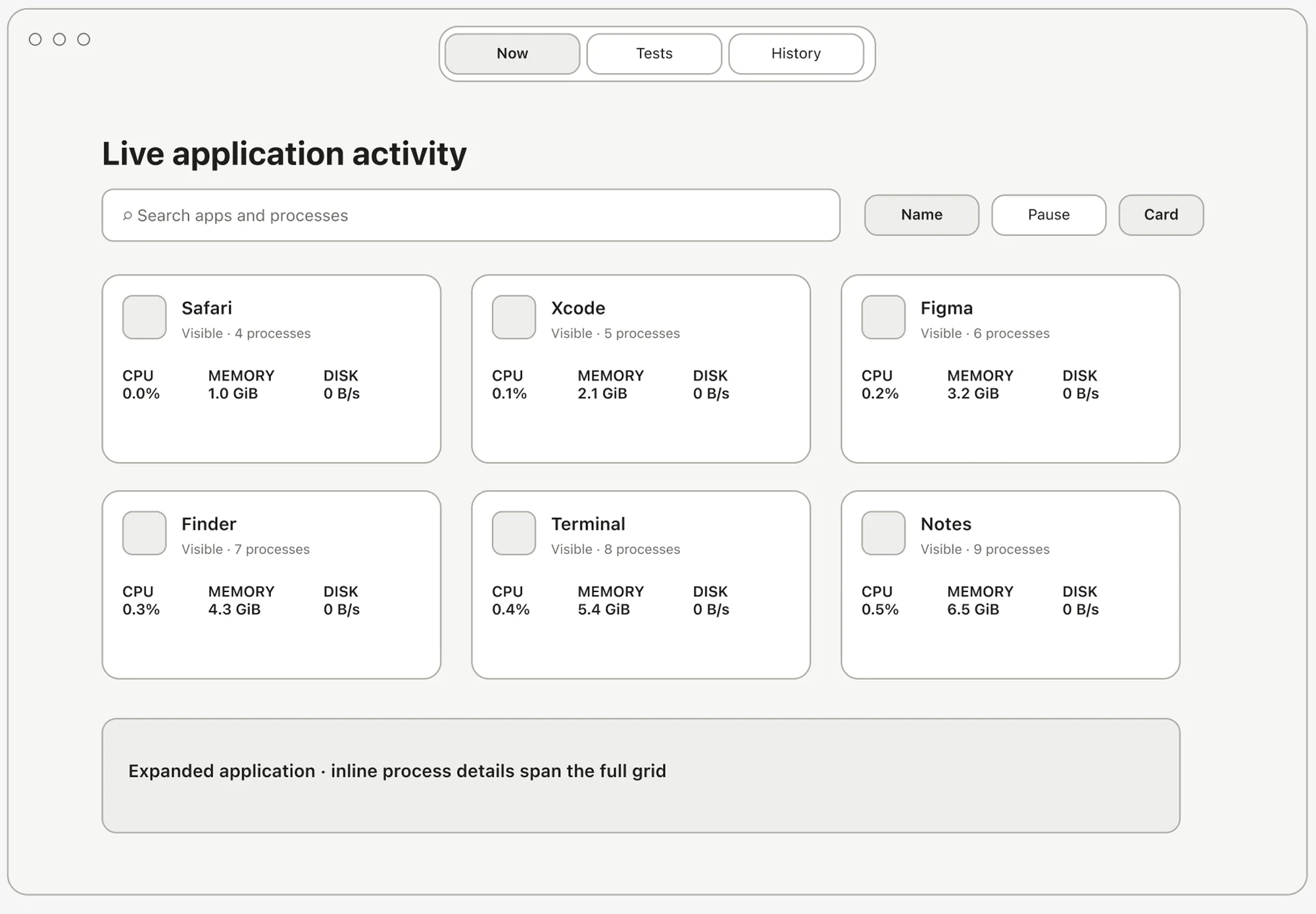
Cards grouped the processes, but comparing apps meant your eyes jumping between boxes.
ABefore: a card per app
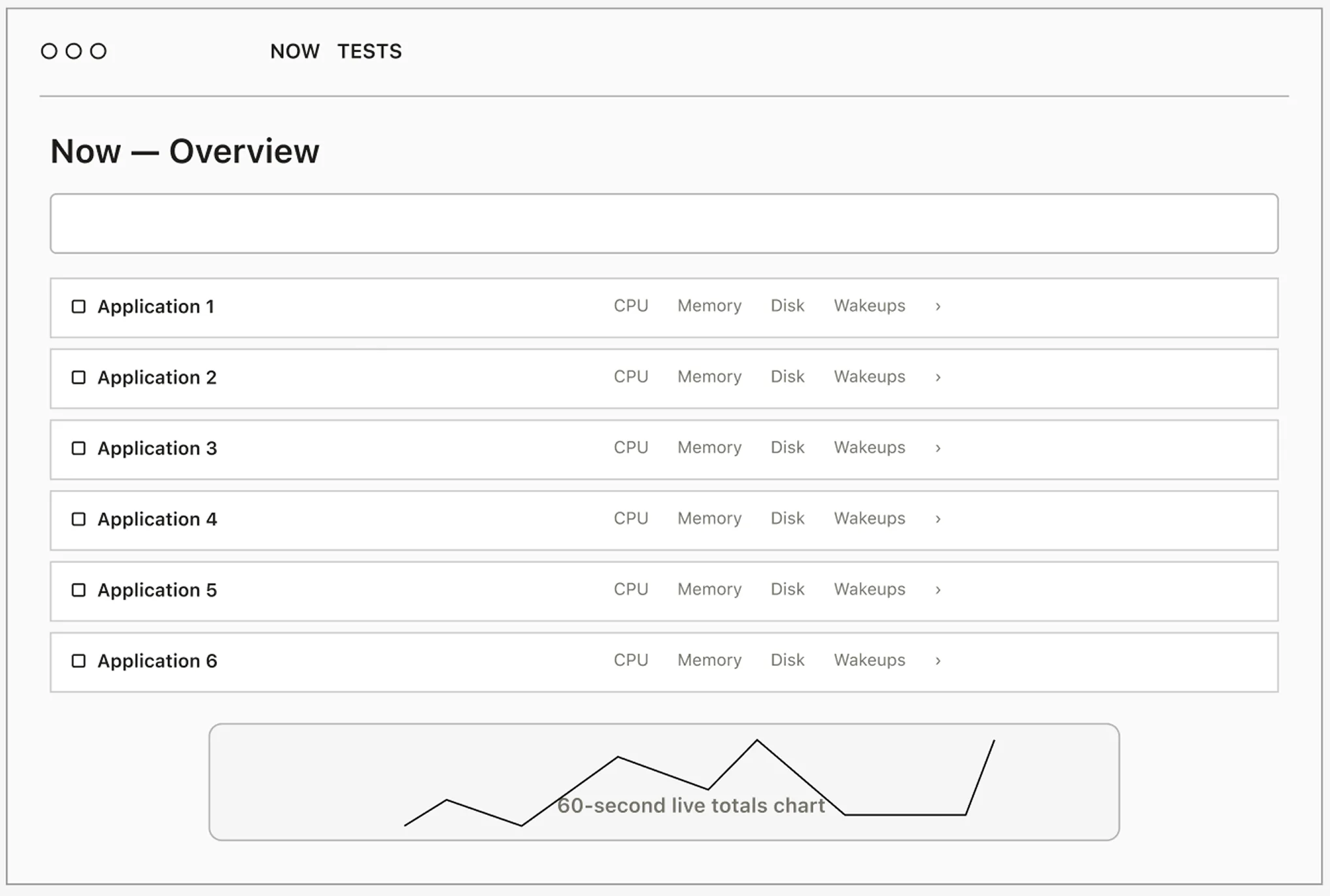
BAfter: an aligned list with a live chart
I switched to a compact list with numbers in aligned columns, and a live chart below it.
With aligned columns, you can compare one metric down a column in a single glance.
The card grid from the first prototype kept the groups clear, but comparing was slow.
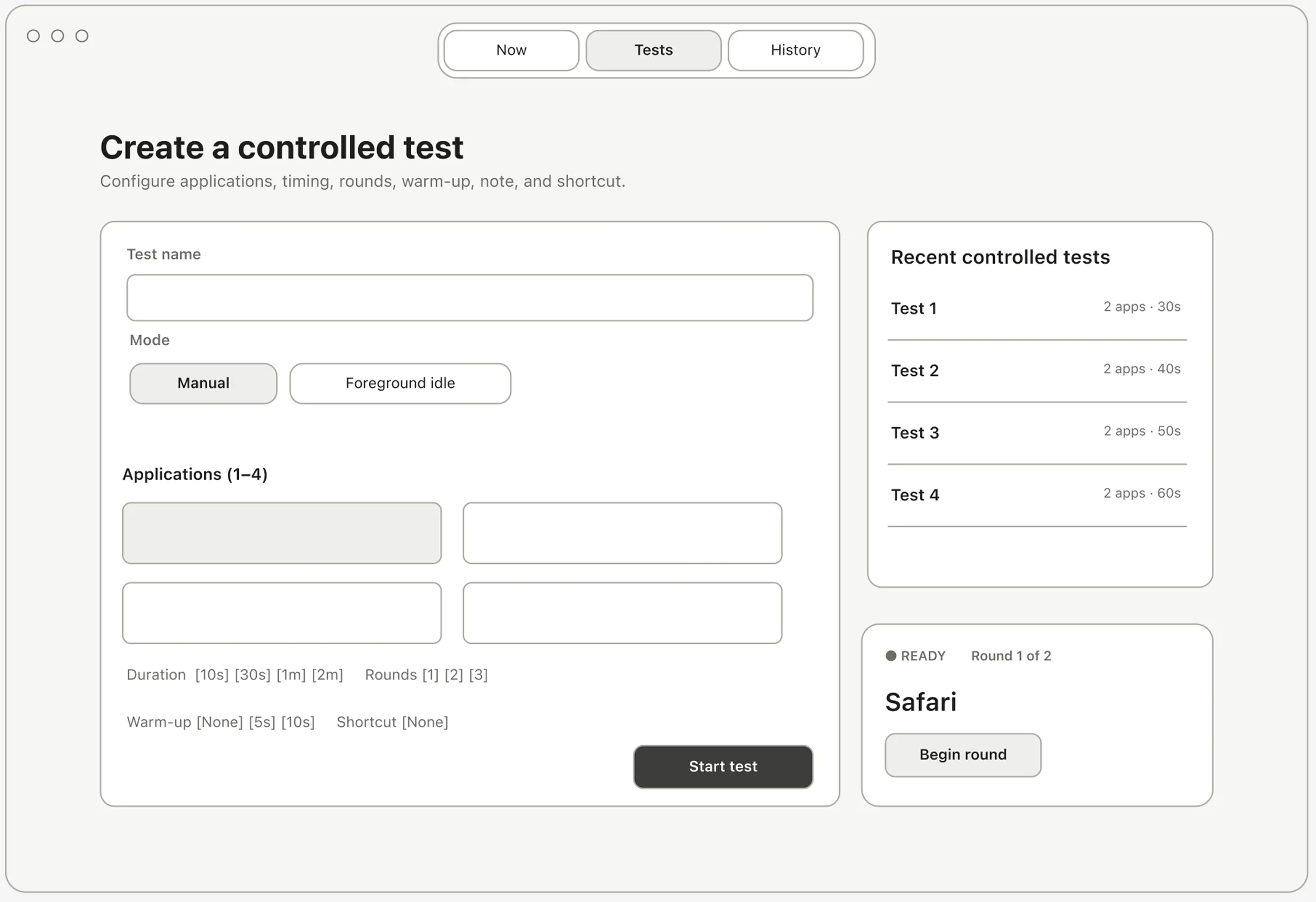
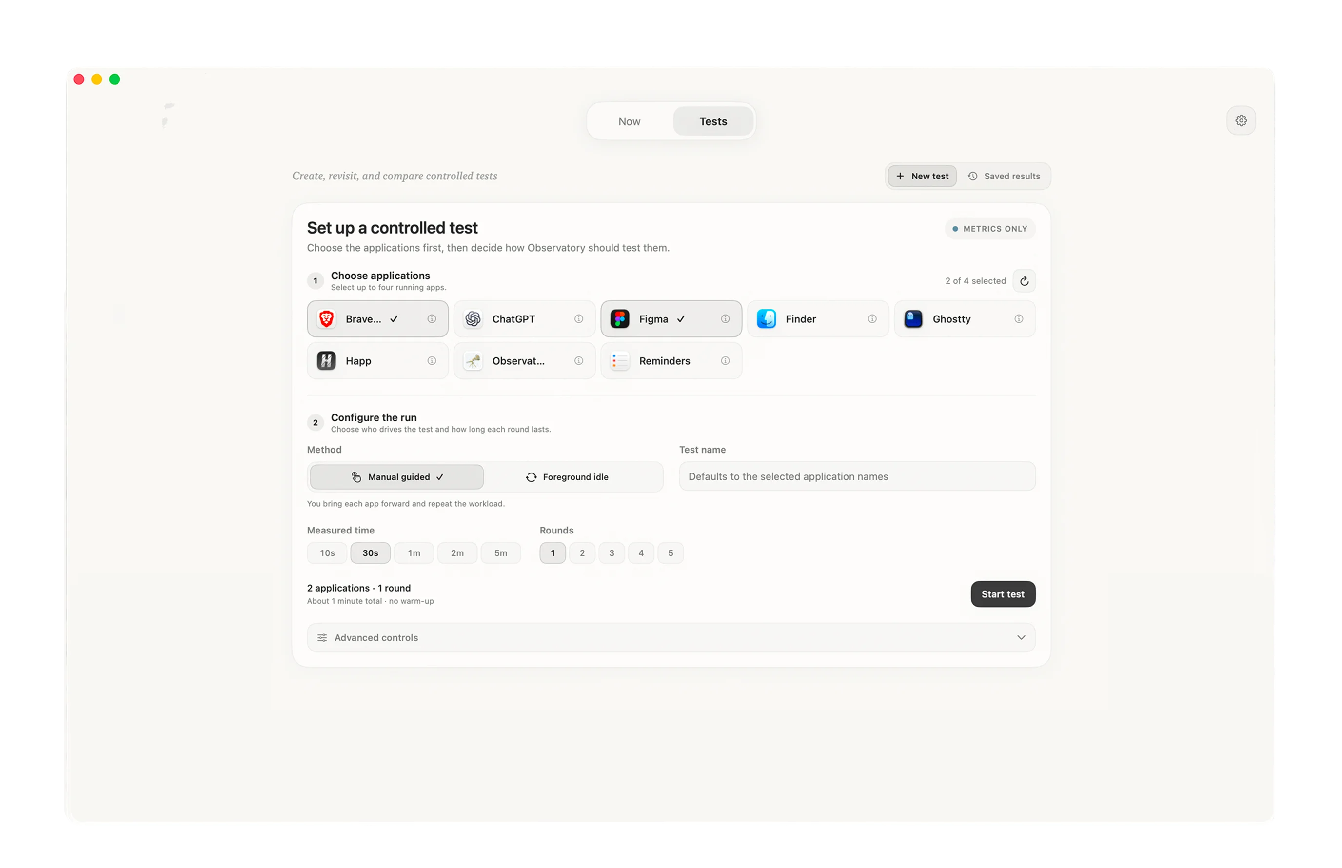
3. Pick apps before the recording mode
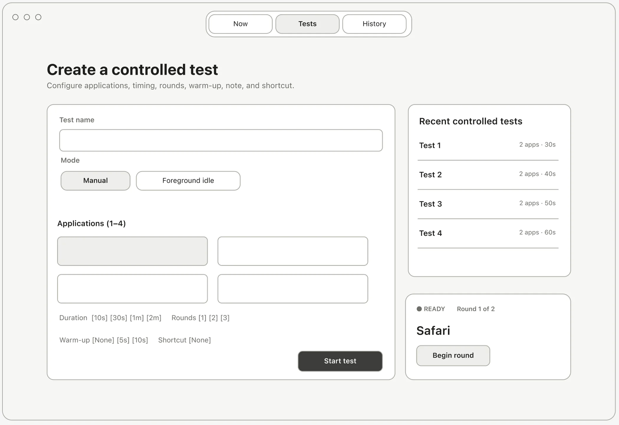
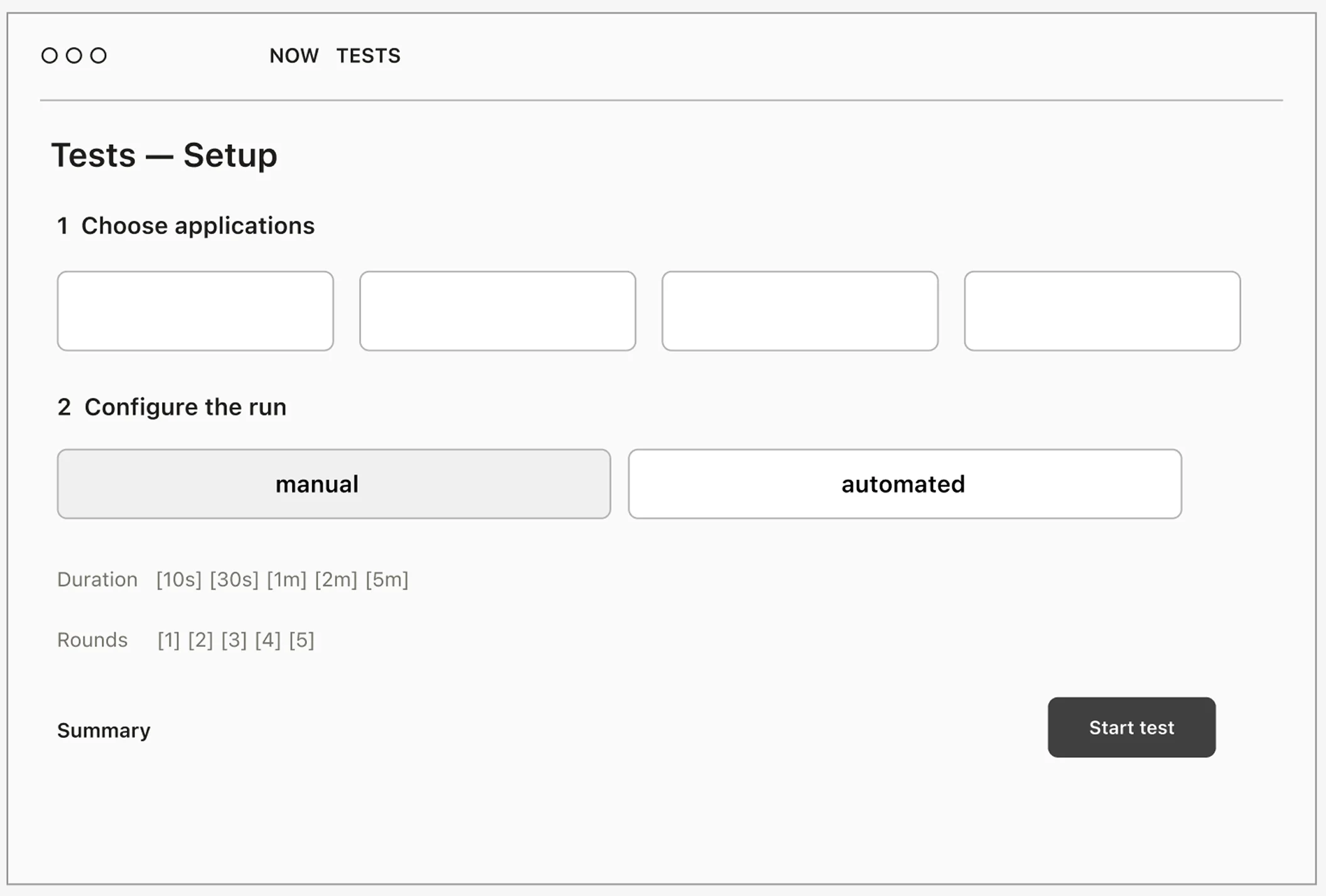
Test setup asked for manual or automated mode before you’d even picked an app.
ABefore: everything on one screen
BAfter: choose, set up, start
Now you pick the apps first, then the recording mode, and setup and the running recording are separate screens.
People start from what they want to watch. How the tool records it comes second.
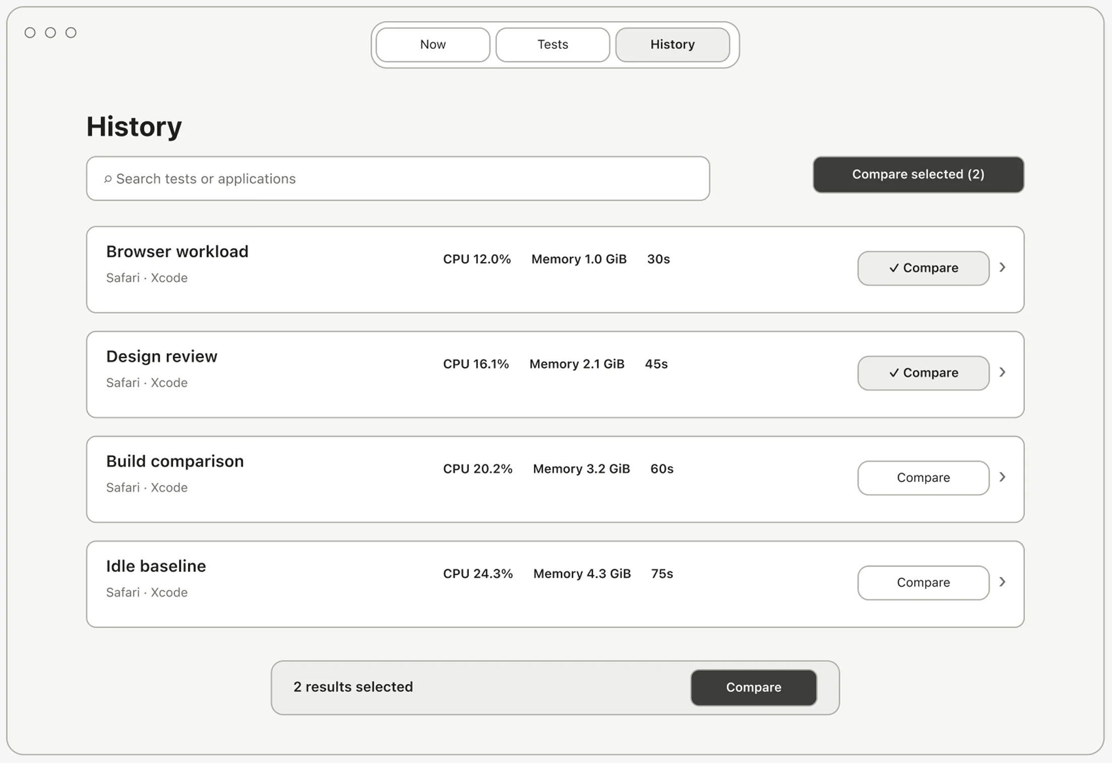
4. Saved results inside Tests
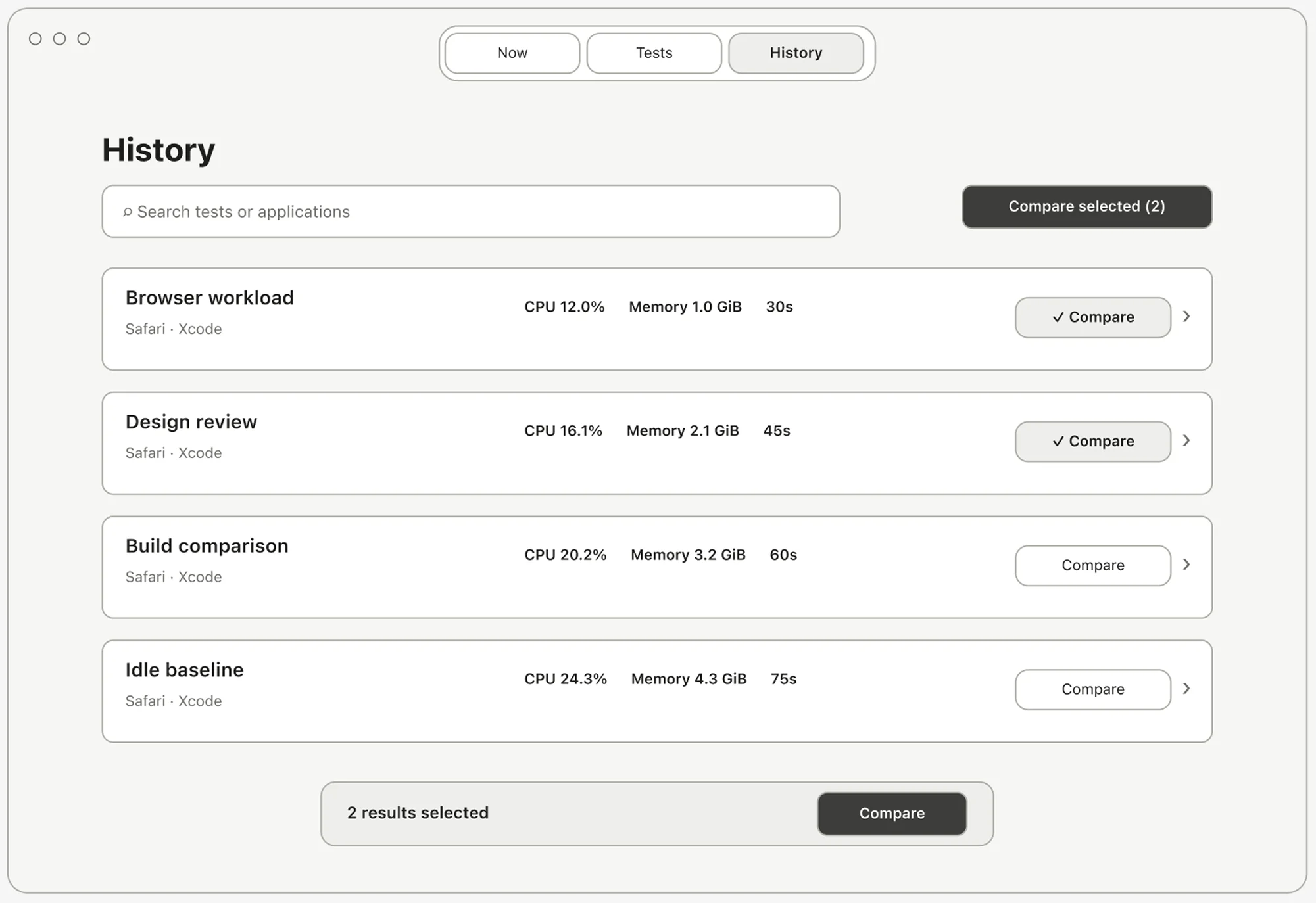
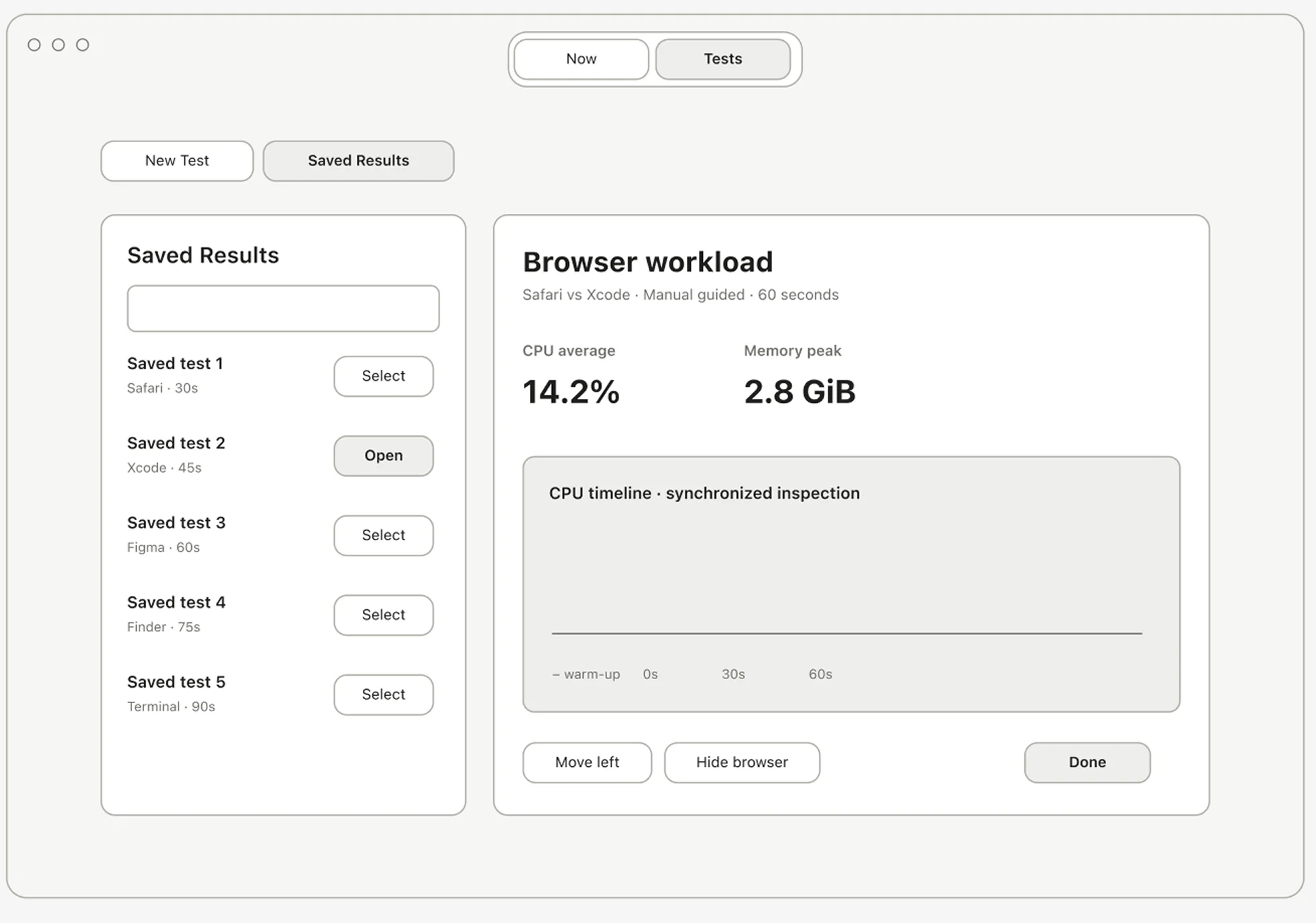
A test ended in Tests, but its result lived in History, a separate section.
ABefore: History as its own section
BAfter: Saved Results inside Tests
I moved results into Tests as Saved Results, with a sidebar list while a result is open.
The information architecture should follow the task, so the next step is always right after the last one.
Top-level sections went from 3 to 2.
counted from the prototypes
Results
Observatory 0.1.1 runs on macOS 14 and later. The live view keeps the last 60 seconds in sight. Tests record one to four apps, with optional warm-up and repeated rounds, and recordings stay on your Mac.
Time to answer “how much memory is Brave using?”
Activity Monitor: find and add 17 rows
≈60 s
Observatory: read one row
≈3 s
One mark is 3 seconds. Estimate from walking through both apps. Activity Monitor also keeps refreshing while you add.
All 3 colleagues who tried it still use it after two months. They mostly use Tests, for two things: recording an app before and after a change, and comparing apps of one kind, like the terminals Ghostty, kitty, and Alacritty.
Every app is one row. The live chart keeps the last 60 seconds.
I’d group apps by what they’re for. My colleagues were already comparing apps of one kind, picking them one by one. Grouping by category applies the same idea one level up: similar things together.
Terminals3
Ghostty
kitty
Alacritty
Code editors2
Xcode
VS Code
AI apps2
ChatGPT
Claude
Concept: one pick adds a whole category to a test.
Setting up a terminal comparison
Now,4 steps
Pick Ghostty
Pick kitty
Pick Alacritty
Start
With categories,2 steps
Pick Terminals
Start
Proposed, not built yet.
After that, I want to test with people outside my team: can they tell what happened in a run, and which recordings are worth comparing?